ClusterTriage / Blog / Cluster assessment
How we Follow Up on the Hyper-V Cluster Assessment
A Hyper-V cluster assessment that ends with a single PDF is a snapshot, and a snapshot ages the moment you start fixing things. Real remediation runs over weeks, in rounds, and the value of the engagement is decided by whether everyone can see what moved, what is still open, and which way the trend is heading. That is a reporting discipline, not a one-off document, and this article is about how to run it.
The pattern ClusterTriage uses on every recurring cluster assessment has three connected building blocks: a delta report that, after a follow-up measurement, says what changed and why, a remaining-risk document that serves as the working to-do list, and a risk trend chart that shows management in one glance which way things are heading. None of them contains a customer name in this article. The mechanics are what transfer.
1. Why one cluster assessment report is not enough
The first deliverable of a cluster assessment is a findings document: a numbered list of issues, each with a risk, evidence, and a recommendation. That document is correct on the day it ships and starts decaying immediately, because the whole point of delivering it is that someone now goes and fixes things. Two weeks later half the High Risk findings are closed, one fix turned out to have a side effect, the customer replaced a domain controller in the meantime, and the original PDF describes a cluster that no longer exists.
You can handle that in two ways. You can re-issue the whole findings document every round, which buries the reader in unchanged text and makes it hard to see what actually happened between versions. Or you can report the delta: keep the baseline as the system of record, and on each round publish a focused document that says exactly what changed, plus a slimmed view of what is still open, plus a chart that shows the trajectory. The second approach is what keeps an engagement legible over six or eight weeks of work.
The baseline findings document stays the anchor. Every later report references its finding numbers, so a reader can always trace a closure back to the original description. What changes round to round is the delta on top of it.
2. The three building blocks of a progress report
A progress round produces three things, and they are deliberately separate because they serve three different readers.
- The delta report. For the record. Per finding, it states the old level, the new level, the reason for the move, and the evidence. It includes closures, downgrades, reopenings and new findings with equal weight. This is the document an auditor or a successor engineer reads to understand the history.
- The remaining-risk document. For the team doing the work. Only the still-open findings, ordered by risk, with the resolved and not-applicable items deliberately stripped out. This is the to-do list for the next round.
- The risk trend chart. For management. A single image: count per risk level across every report version, so the direction of travel is obvious without reading a word of prose.
Splitting them matters. If you fold everything into one file, the team working the list has to wade through resolved history, and management has to read engineering detail to find the one number they care about. Three building blocks, three audiences, generated from one set of measurements.
3. The delta report: what changed and why
The delta report is built per finding, and every finding that moved gets a small block: its number, its title, the new risk badge, and a short "current situation" paragraph that cites the measurement that justifies the move. The categories of movement are fixed:
- Resolved. The root cause is fixed and the follow-up measurement confirms it is gone. Example shape: a missing cumulative update is now installed on every node and the build numbers prove it, so the finding closes.
- Lowered. The risk is reduced but not eliminated. The finding stays open at a lower level with the residual risk named explicitly.
- Reopened. A finding that was closed or low has moved back up, usually because a fix had a side effect or a benign-looking condition reappeared after maintenance. This is reported as prominently as a closure.
- New. Something the latest measurement surfaced that was not in scope or not present before.
The objectivity of the delta report lives in that "current situation" line. You do not write "patching done". You write what you measured: the validation run timestamp, the count of tests passed and the warnings that remain, and why the remaining warnings are benign or not. A reader who was not in the room can reconstruct the judgement from the evidence. That is the difference between a status update and a delta report.
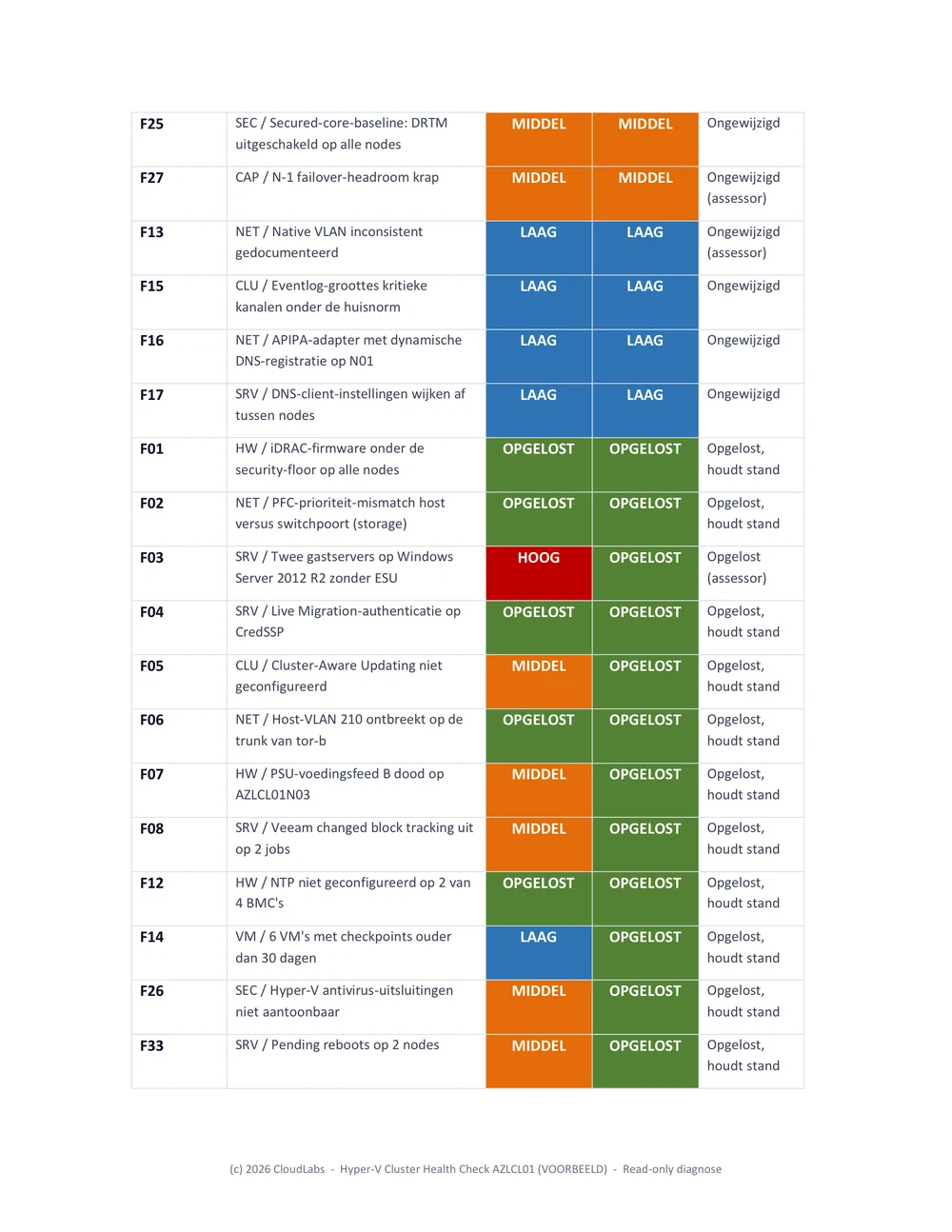
An excerpt from a delta report, in the report's own voice. These findings are from the fictional Noorderlicht sample engagement (a demo environment, no customer data): two closures backed by follow-up measurement, an open finding that stayed at its level, and a new one that surfaced this round. The shape is exactly what a real delivery carries:
F01  HW / iDRAC firmware below the security-floor on all nodes   HIGH -> RESOLVED
  Current situation: plane D read of 16 Jun measures iDRAC9 7.10.70.00 on all
  four nodes, above the 7.10.50.10 security-floor. Root cause fixed. Closed.

F09  SRV / WAC gateway two releases behind the go-forward line   MEDIUM (unchanged)
  Current situation: gateway still at 2.4331.0, two releases behind. Update
  planned in the August window. Stays open at MEDIUM.

F33  SRV / Pending reboots on two nodes                          NEW -> MEDIUM
  Current situation: surfaced this round on AZLCL01N02 and N04 after the June
  patch pass; not present at baseline. New finding, opened at MEDIUM.

F07  HW / PSU power feed B dead on AZLCL01N03                     MEDIUM -> RESOLVED
  Current situation: both feeds measured live on the iDRAC of N03 (PSU1 and
  PSU2 each about 210 W); redundancy restored. Closed.
Each line carries its own justification: a closure rests on a re-measured version above the floor, an unchanged finding keeps its level with the reason it is still open, a new finding is opened at the level the measurement warrants, and a Resolved is only granted when the thing is measured gone rather than merely deployed. Read together they let a reviewer audit every level change without attending a single meeting.
4. The remaining-risk document: the working list
The remaining-risk document is the delta report's opposite in spirit. The delta report is about history and is comprehensive. The remaining-risk document is about the present and is ruthless: it contains only the findings that are still open, ordered High then Medium then Low, and it deliberately drops everything that is resolved or not applicable, because a to-do list that includes finished work is noise.
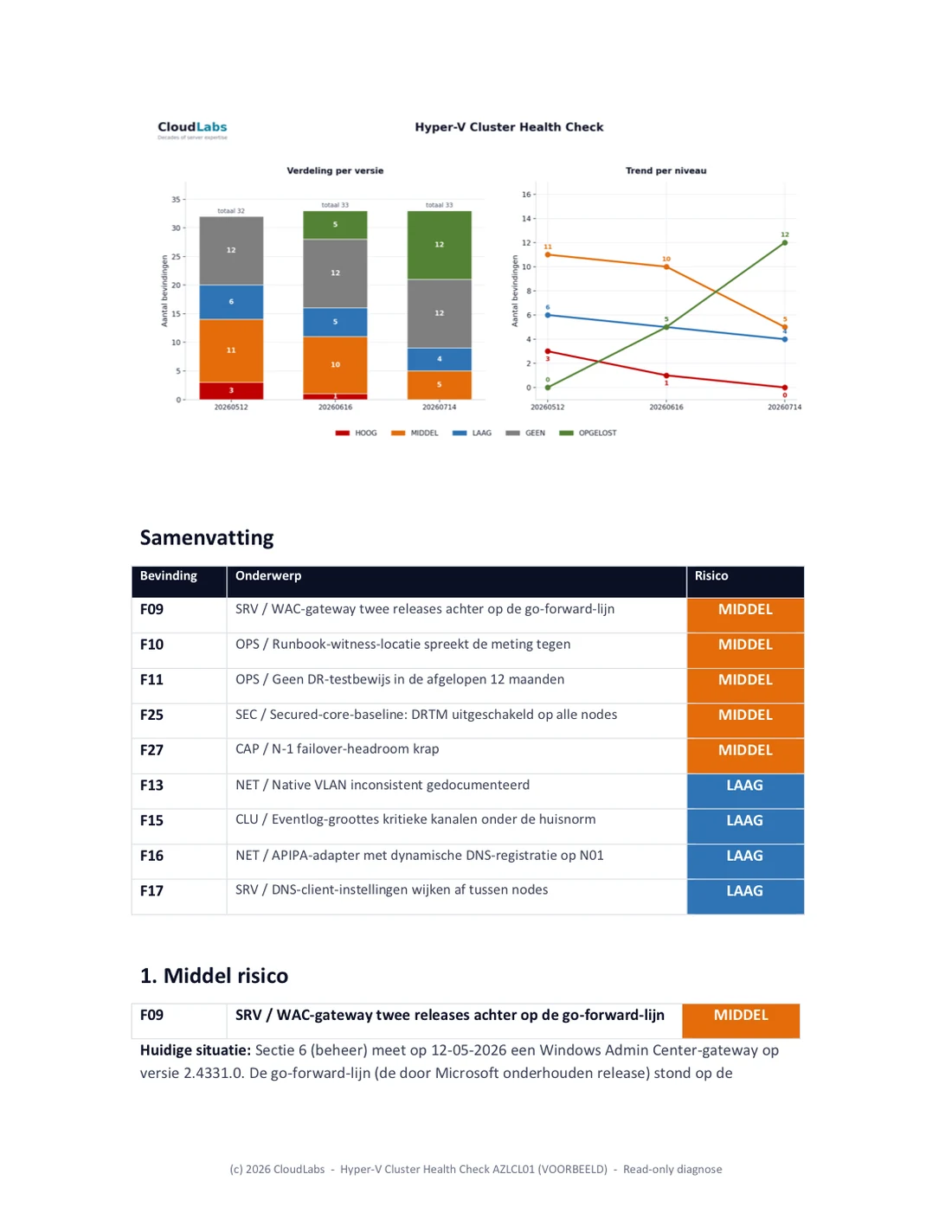
It is the document the customer's team actually opens during the next maintenance window. Each open finding carries its current measured numbers, not the baseline numbers, so a finding that was lowered from High to Medium shows the Medium-level reality and not the original alarm. Where a finding is partly resolved, for example a storage imbalance that is fixed on most volumes but not all, the document shows the per-item status so the remaining work is visible at the granularity of the work, not the granularity of the finding.
Putting the trend chart at the top of this document, before the open findings, gives the reader the context before the detail: here is where we are, here is what is left. It is a small thing and it changes how the document reads.
If your last cluster assessment was a single PDF and the remediation since then lives in someone's head and a spreadsheet, you have no defensible picture of whether the cluster got better or just busier.
A ClusterTriage Hyper-V cluster assessment is structured as rounds with a delta report and a trend chart, so progress is measured, not asserted.
Schedule a cluster assessment intro call →5. The risk trend chart: the one-glance picture
The chart is the piece management remembers. It plots the count of findings per risk level across every report version, as a stacked bar per version with a trend line per level on top. One look answers the only two questions leadership asks: is High Risk going to zero, and is anything creeping back up.
The chart below is from the fictional Noorderlicht sample engagement, three measurement rounds across a multi-week engagement. Click the chart to enlarge it:
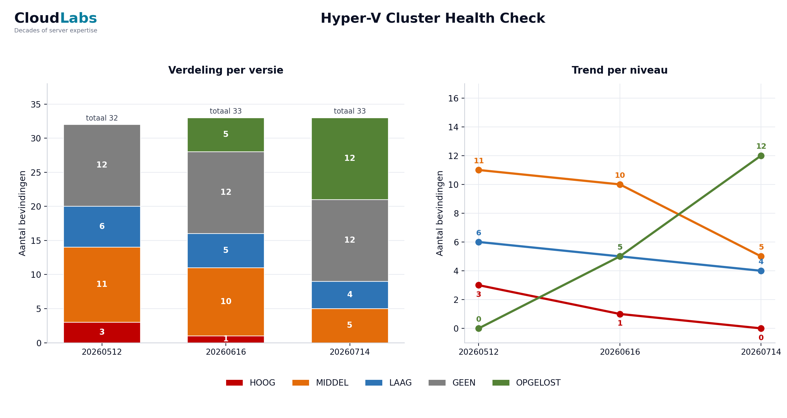
The same numbers in a table, for screen readers and quick reference:
| Risk | Baseline | Round 1 | Round 2 |
|---|---|---|---|
| HIGH | 3 | 1 | 0 |
| Medium | 11 | 10 | 5 |
| LOW | 6 | 5 | 4 |
| NONE | 12 | 12 | 12 |
| RESOLVED | 0 | 5 | 12 |
Three things in that table are worth saying out loud. First, High goes to zero across the three rounds, which is the headline management asks for, but it does not get there by findings vanishing: they move to Resolved and stay countable. Second, the Resolved count is its own column and only grows (0, 5, 12), because a finding that is genuinely fixed should never silently leave the report; keeping it visible is what stops the trend from being gamed by deleting closed items. Third, None holds flat at 12: those are the items that were checked and found in order at baseline and stay that way, the evidence of what was verified, not silence. The total findings count barely moves (32, 33, 33) while the risk inside it drains from red to green, and that is the whole point of counting every level on every version.
Build the chart with the same risk colours used everywhere else in the reporting, so a reader who has seen one badge recognises the bar. High Risk red, Medium orange, Low blue, None grey, Resolved green. Consistency across the delta report, the remaining-risk document and the chart is what lets someone move between the three building blocks without re-learning the legend each time.
6. The discipline behind the colours
A five-level taxonomy only works if the boundaries are defended. The two that get abused are the top and the bottom of the "good news" range, so they get explicit rules.
Resolved versus Lowered. Resolved is reserved for a fixed and re-confirmed root cause. If the risk is merely contained, the finding is Lowered, not Resolved. A workload isolated behind a VLAN so that nothing reaches it any more is a real and valuable mitigation, but the underlying object still exists, so it is Low, not Resolved, until the problem is genuinely resolved. The absence of exposure from where you happen to be standing is not the same as the cause being gone. Holding that line is the single most important reporting decision in the whole engagement, because it is what stops the trend chart from flattering everyone.
Reopened versus stayed-fixed. A finding that comes back is reopened visibly. After a maintenance round it is common for a benign-looking condition to reappear on every node, and the right move is to report it back into the list at the appropriate level with the explanation, not to quietly leave it closed because it was closed last round. The reader trusts the trend precisely because regressions show up in it.
7. Follow-up measurement is what makes it objective
Every round starts the same way it did at baseline: the same or an improved read-only inventory script, run from the customer's own management server, plus a fresh cluster validation. Nothing in the progress report comes from a meeting or a recollection. A finding only moves on the strength of a measurement taken after the change, and the report cites that measurement by its run: the inventory file, the validation timestamp, the specific counter.
This also catches the moving parts that a status-update style of reporting misses. A domain controller replaced mid-engagement, a node that briefly fell out of the management subnet, a validation warning that was measured before the patch reboots and is stale by the next round. Because the measurement is re-run rather than remembered, the report describes the cluster as it is on the day of the follow-up measurement, not as it was when the work was scheduled.
The mechanics of that read-only inventory and the pre-flight that keeps it self-documenting are covered in From Cluster Assessment to Patch Night: The Method at Work. The progress reporting in this article is the layer that sits on top of those measurements over multiple rounds.
8. Making it repeatable
The reason to standardise the three building blocks is that the next round, and the next engagement, should not re-invent them. The pattern that holds up:
- Keep the baseline findings document as the system of record and never renumber its findings. Every later report references those numbers.
- Generate the delta report, the remaining-risk document and the trend chart from the same round of measurements, so the three can never disagree with each other.
- Use one risk taxonomy and one colour set across all three, and defend the Resolved boundary strictly.
- Put the trend chart at the top of the remaining-risk document so context precedes detail.
- Cite the run behind every level change, so the report is reconstructable by someone who was not there.
Do that and a cluster assessment stops being a PDF that ages on a shared drive and becomes a measured trajectory that anyone can read in one image and trust in the detail. That is the deliverable customers actually keep.
Schedule a Hyper-V cluster assessment intro call →
Frequently asked questions
Once per measurement round, which in practice means after every batch of fixes that is large enough to change the risk picture. On a typical engagement that is every few months, though the customer can ask for a higher frequency, especially when there are many issues to work through. Each round re-runs the same read-only inventory and validation, so every report is built on a fresh measurement, not on a status meeting.
Resolved means the root cause is actually fixed and measured as gone in the follow-up measurement. Lowered means the risk is reduced but the cause is still present, for example a workload isolated by VLAN instead of fully removed. Mitigation moves a finding down a level. It does not close it. Keeping that line strict is what keeps the trend chart credible.
The full report carries history, resolved items and context, which is what you want for the audit trail. The remaining-risk document carries only what is still open, ordered by risk, which is what the team actually works from in the next round. Two audiences, two documents.
Every round reports reopened and newly discovered findings alongside the resolved ones. A finding can move back up a level if a fix introduced a side effect, and that reopening is shown with the same weight as a closure. The trend chart counts every risk level on every version, so a regression is visible as a bar that grew.
Yes. The risk trend chart plots the count per risk level across every report version, as stacked bars with a trend line per level. One image shows whether High Risk is going to zero and whether anything is creeping back up. It is generated from the same numbers that drive the detailed reports.